UX Design
5 Common Mistakes of Bad UX Design and How to Fix Them
Have you ever heard the phrase, "With great power comes great responsibility"? It’s a phrase made popular by none other than Stan Lee himself. Anyone involved in creating UX design should apply this same principle as undoubtedly, UX designers carry a lot of weight when it comes to the success of a user interface. Whether you are designing a website, app, or any other type of product for the general public, then you have the power to create an outstanding user experience. If your design is not up to par, then your product will not be successful. This article will cover 5 common mistakes of bad UX design and how to fix them.

Effective User Experience (UX) can help to create meaningful relationships and connections with customers. On the other hand, poor UX can send customers running in the opposite direction.
Obviously, no one wants to find themselves in a position where they’re scaring away customers. Join us while we explore mistakes of poor UX design and, more importantly, how to fix them.
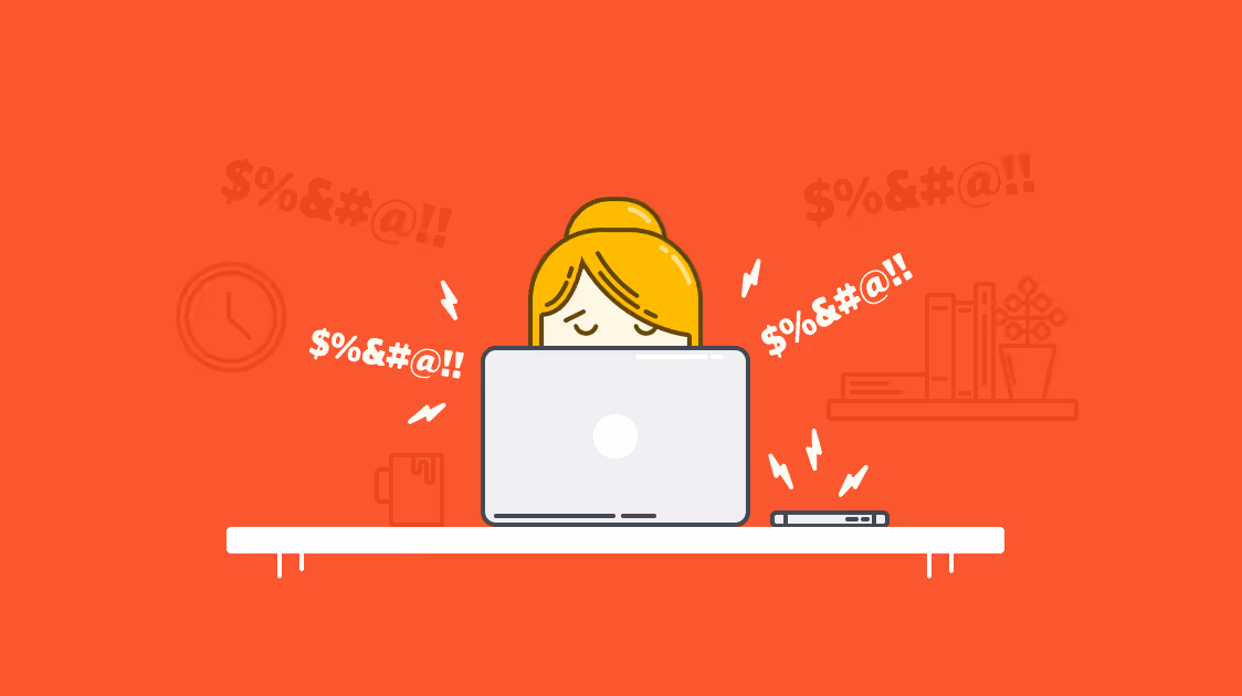
UX Design Gone Bad
Before we start, let’s get something out in the open. If you find yourself “guilty” of any of these UX mistakes, don’t be too hard on yourself! Even tech giants have committed some of these blunders at some point.

While it’s important to avoid such mistakes, it’s also beneficial to know how to fix them if they happen. Maximizing the experience for users should always be the top priority.
When done well, UX design is virtually invisible to its users. -Jaye Hannah, CareerFoundry
Let’s not delay any further! Here are some of the most common UX design mistakes and how to remedy them:
1. Notification of deleted messages
I can almost guarantee that you know exactly what app in specific I’m talking about. This amazing app has been successful because of its great UX design. We are, of course, talking about WhatsApp.
However, not even with all its other great features can WhatsApp be forgiven for this one grave UX mistake...
Certainly, most of us have accidentally sent a message to the wrong person. Or perhaps, like myself, you sent your boss a sticker of you as a disgruntled child instead of that cute Snoopy sticker with the thumbs up.
When this horrifying mistake happened, I immediately deleted my angry child sticker. But it was too late. There it was on the screen. Proof of my deleted message existed.

My co-worker even asked me what I had deleted. I admitted my mistake to her and was just grateful our boss never saw it.
The problem with this is that WhatsApp shows the recipient that you deleted the message. That’s a poor design decision. It makes the person deleting their message look sneaky or suspicious. In some cases, it can even cause minor heart attacks (speaking for myself, of course).
How to fix it:
Avoid sending a notification in the first place. A simple notification message given to the person deleting the message could have saved this interface design. Honestly, why is it even necessary to let everyone know you made a mistake? Effective UX design should make users have a good experience instead of a potentially embarrassing one. Remember to keep that in mind when designing your own projects.
2. Autoplay videos
Definitely, one of the most annoying UX design blunders out there is autoplay videos. Whoever came up with this design feature does the devil’s work.
For example, if you’ve ever made the innocent mistake of having your volume high while navigating on Netflix, then I'm sure you’ve experienced more than one jump scare. Shouldn't the user be given a choice if they want to see a trailer or not? Unless it’s The Witcher, I honestly prefer to click on what I wish to see instead of being forcibly submitted to it.

Additionally, the user must hover over the details of the movie or show to quickly view the details. However, it makes it difficult to focus on the information you’re looking for while the audio is blasting away.
Another site guilty of using autoplay videos is CNN. Plus, they have the bonus of relentless pop-ups. That’s a combination of one of the worst user experiences out there.

How to fix it:
If a feature gets in the way of a site’s usability, it simply shouldn’t be there. One option could be for the user to hover over the thumbnail rather than the description to view a trailer. When designing an interface, make sure that you are not creating elements that distract a user from important information.
3. Cluttered displays
Without a doubt, sometimes less is more. For example, it might seem tempting to display as much information as possible on a homepage. You want your users to know all about you and your products, right? Even so, this will only cause the opposite effect.
The only thing you’ll achieve by a cluttered display will be cognitive overload for your users. This defeats the purpose of trying to get valuable information to your users. Also, the loading speeds will slow down. These things combined will cause your users to become impatient and abandon your site.
Cluttered displays are a flaw that affects Apple’s iTunes UX design. Users can become overwhelmed when submitted to too much all at once.

How to fix it:
A menu could organize albums rather than display them all onto the landing page in a confusing order. If you can use a menu to avoid bombarding your users with information all at once, do it. Your users will thank you for it!
When it comes to interface organization, menus are one of the most excellent tools at our disposal. - Erica Martin, UsabilityGeek
4. Difficult navigation
Not only should a website or app be pleasing to look at, but it also needs to be functional. Good UX design needs to be easy to use and not complicate a user’s existence. This includes going from point A to point B without it being a hassle or a mystery that needs solving.
Indeed, it seems that the beloved Amazon website forgot to follow this principle on a key feature in this case. Specifically, we’re talking about the Amazon header. In the desktop view, you see a horizontal row of destinations. However, most of the menu is hidden under the mobile menu toggle.
The menu “hamburger” icon is jammed into the top left corner. As a result, the menu toggle is very hard to locate.

Well, thank goodness for that giant red arrow pointing to the menu toggle in this image! If not, it would have taken me ages and lots of patience to find it. Finding a menu toggle shouldn’t have to be like trying to find Waldo.

How to fix it:
Above all, always keep the user in mind when it comes to usability. Keep the navigation on your site or app simple, with key features such as menus readily available to your users. No matter how nice your site might look, if your users can’t easily navigate through it, then you’re guilty of poor UX design.
5. Complicated password requirements
Last but not least, we have a UX blunder that can unite all users in our collective distaste for it. The dreaded ridiculously complicated password requirement is truly a cause for frustration.
I mean, isn’t it difficult enough remembering several different yet simple passwords? And now I’m expected to remember an overly complicated one?

Not only is a long list of requirements to create a password time-consuming, but it’s also unnecessary. Difficult password requirements are bad UX because they’re created by security experts who have no idea how difficult it is for people to remember things.

How to fix it:
While you might think that complicated passwords will protect your users, you more than likely will end up frustrating them. Instead, provide the option to create a quick, easy-to-use password that is personal to them. Another option is to make it easy for users to log in with their social media accounts.
The Beauty of UX Design
Finally, remember that even if you realize that you have committed any of these UX design mistakes, there’s always a way to fix them. And that’s one of the best parts of designing. There’s always room for improvement and the possibility of reinvention!

Let’s talk.
Reach out to us on Facebook or LinkedIn and let us know you have fixed UX design mistakes on your projects. Or follow us on Instagram for a bite-size version of our blog.